This post may contain affiliate links. Please read our disclosure policy.
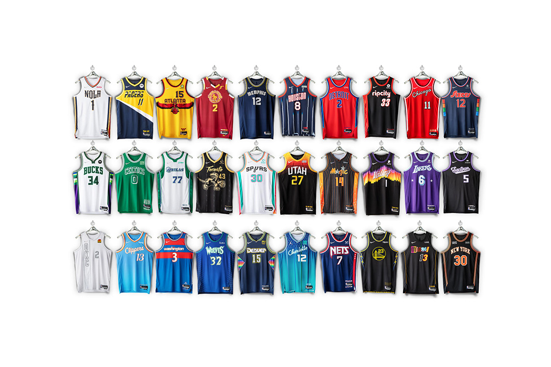
Since Nike took over to be the official outfitter of the NBA back in 2017, the Swoosh and the NBA debuted the City Edition jerseys every season which takes inspiration from each team’s history and the city itself for the design every season and we get an official look at the City Edition jerseys for the NBA’s 75th anniversary.
The season’s City Edition jerseys blend and mix each team’s heritage and history from different eras throughout the league’s 75 years.
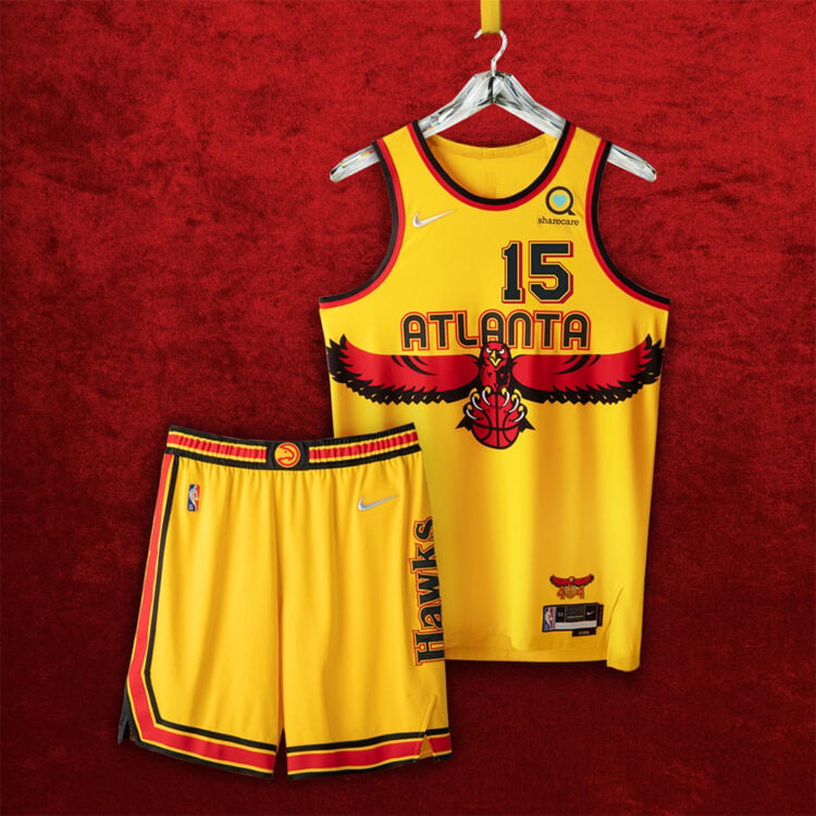
Atlanta Hawks – The standout feature is the Dikembe Mutombo era wingspan logo across the chest from the ’90s with the ’70s era Atlanta font above the Hawk. More tributes to the past are seen on the front numbers and striping on shorts that go back to 1968 and the logo over the jock tag features ATL’s 404 area code alongside the razor-talon Hawk.
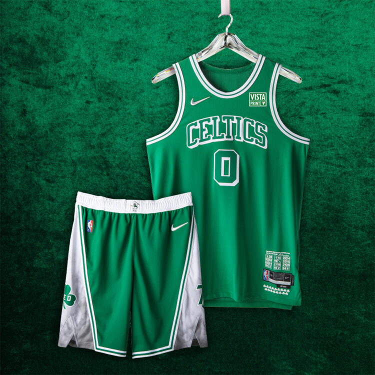
Boston Celtics – Nike could have reached to any era for the Celtics’ rich basketball history and they focused on the lettering and striping from the 1946 and 1949 Celtic teams. An homage to Red Auerbach is seen on the shorts with 75 on the other side to commemorate the Celtics as one of two teams to call the same city home for all 75 seasons. The retired numbers are seen above the jock tag with 17 shamrocks representing each championship.
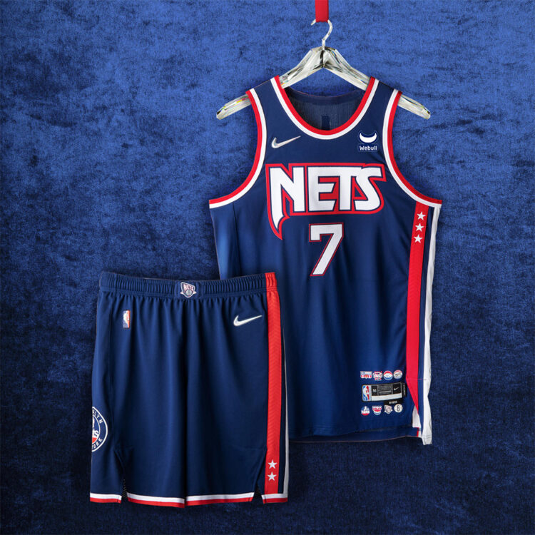
Brooklyn Nets – The Nets use the late ’80s-early ’90s logo on the chest with the striping down the side pays homage to the ABA days of the team. Argyle is seen on the white portion of the striping which takes us back to the 2000s and the Jason Kidd-era teams and a mash-up of logos is printed on the belt of the shorts.
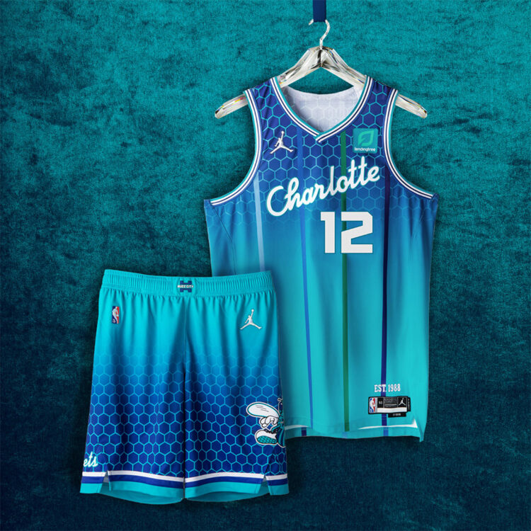
Charlotte Hornets – The Hornets use a script font across the chest which was seen on the original renderings of the jerseys in 1988 and the iconic pinstripes are seen in different colors of the team’s history. A honeycomb pattern that is tied to the Hornets’ court design is seen on the upper half of the jersey and lower half of the shorts and Hugo the Hornet is seen on the shorts as well. And of course, the Jumpman makes an appearance instead of the Swoosh for his Airness.
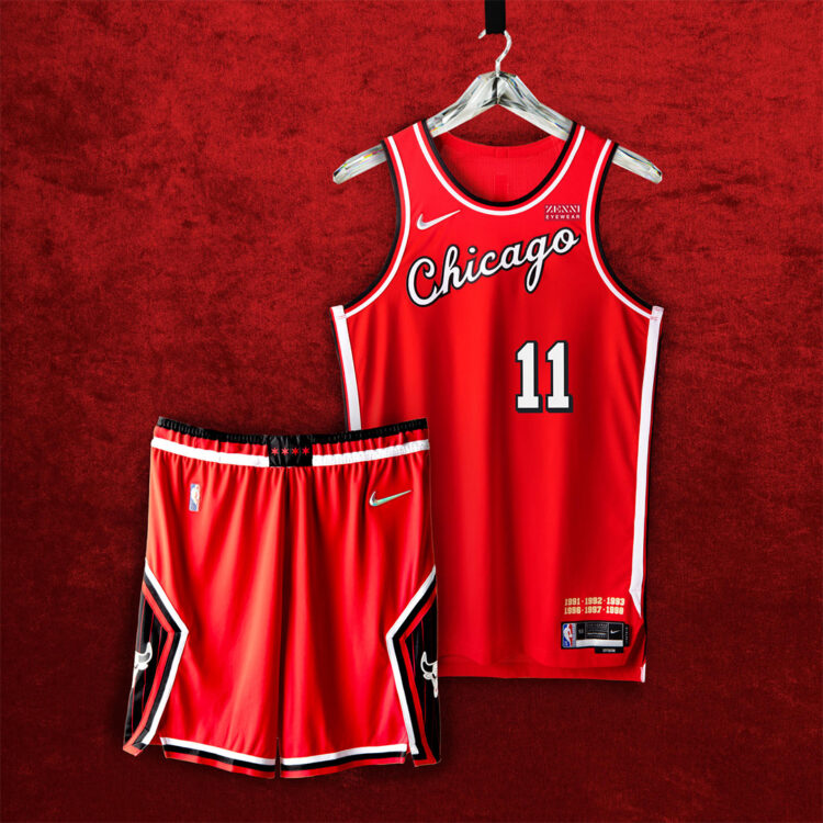
Chicago Bulls – The Bulls go back to the team’s first season in 1966 for the script font on the chest with the shorts featuring the Jordan-era pinstripes on the diamond design on the shorts. The 4 stars from Chicago’s flag are seen on the belt and the 6 championships of the ’90s are seen above the jock tag.
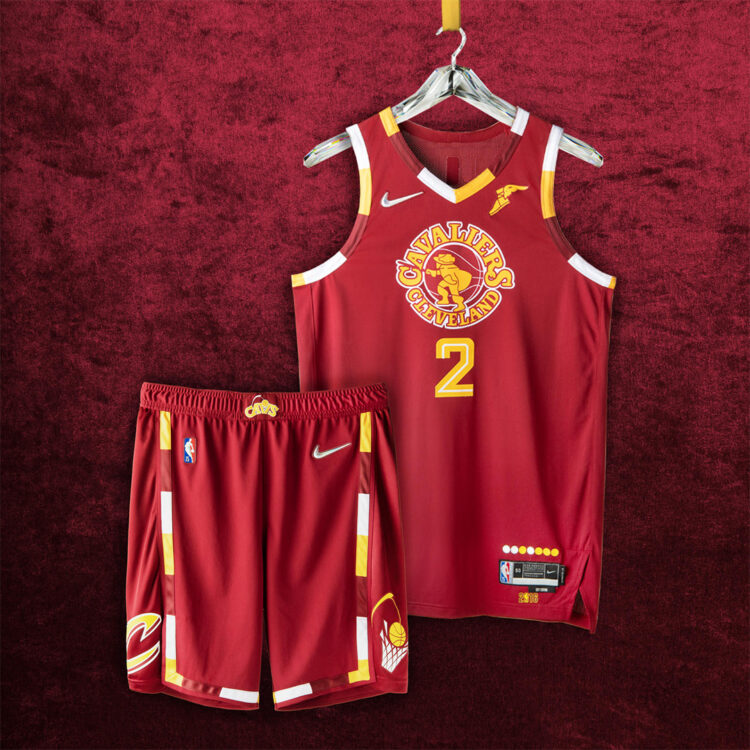
Cleveland Cavaliers – The Cavs use a bevy of logos from its 50 plus year history with the swordsman and trim from the ’70s being most prevalent and the ’90s era number and logo seen on the shorts as well.
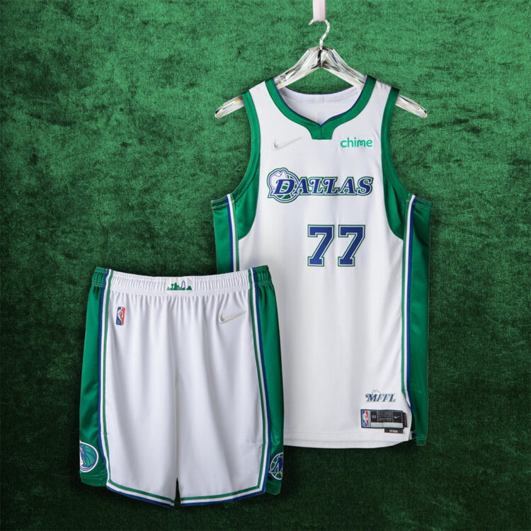
Dallas Mavericks – The Mavs mixes the ’80s era logo with the Cowboy hat alongside the more recent aggressive horse logo throughout. Dallas’ skyline is seen on the belt and “MMFL” which stands for Mavs Fans For Life is seen above the jock tag.
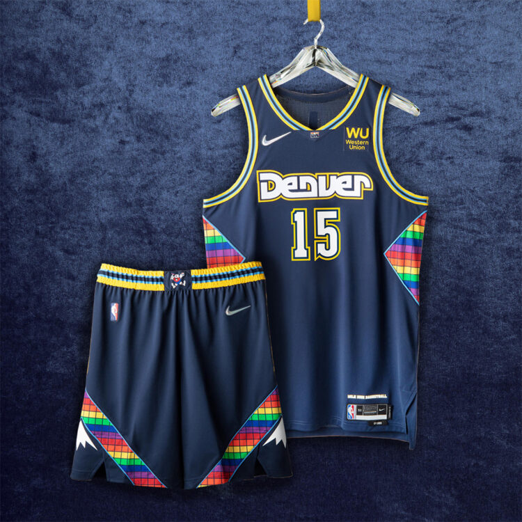
Denver Nuggets – The iconic Rainbow pattern accents the City Edition jerseys for the Nuggets with the Maxie the Miner making an appearance on the belt. The Carmelo Anthony era jerseys are seen on the trim of the jersey and the Rocky Mountains are seen on the shorts.
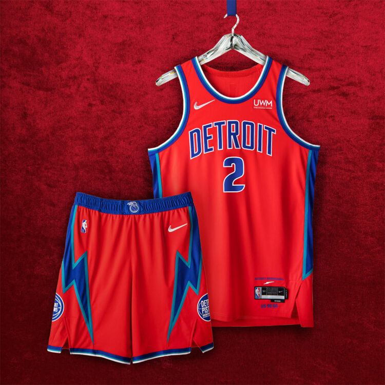
Detroit Pistons – The Pistons keep it simple and classy with their City Edition jerseys with the ’70s era lightning bolts seen on the sides of the jersey and on the shorts with the current and old Pistons logo on each side. The flaming Pistons logo is seen on the belt and the team’s “Detroit Basketball” rallying cry is seen above the jock tag.
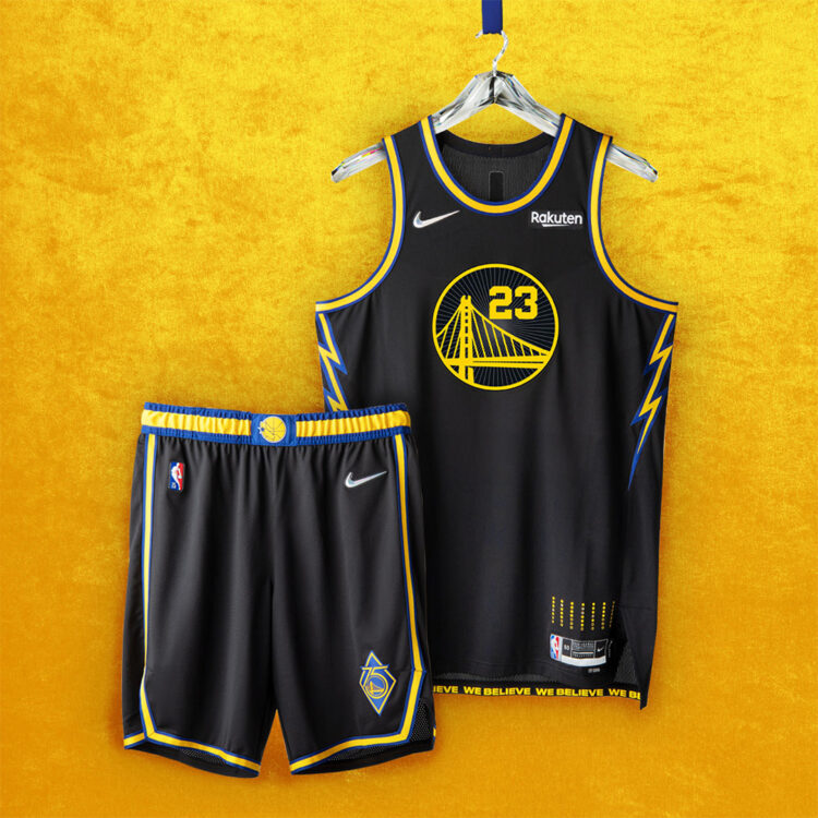
Golden State Warriors – The Warriors celebrate 50 years in Oakland with the “We Believe” era accents seen on the sides and on the Bay Bridge on the chest. The RUN-TMC era logo is seen on the belt with a commemorative 75th-anniversary logo on the shorts.
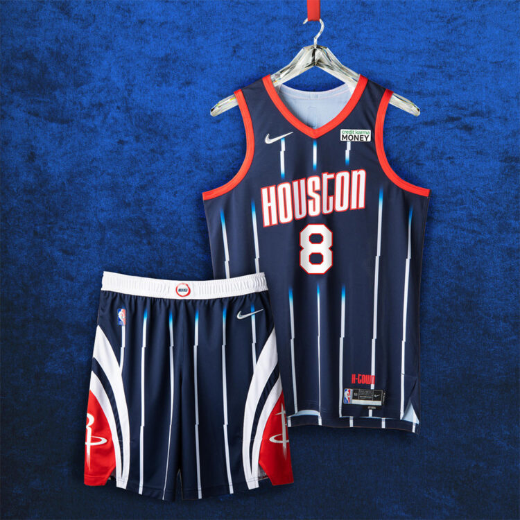
Houston Rockets – The Rockets use the Hakeem Olajuwon era logo on the chest and belt with the ’00s era pinstripes throughout. The shorts use the current template with the Rockets logo on each side of the shorts with the rocket accenting and “H-Town” is printed above the jock tag.
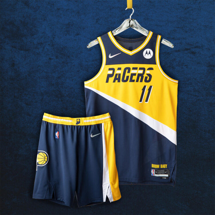
Indiana Pacers – Details from the original 1971 logo are seen on the shorts with the ’80s and ’90s era accenting prominently seen on the chest font and striping. The Hoosier State is front and center on the belt with Bobby “Slick” Leonard’s trademark call “Boom Baby” seen above the jock tag.
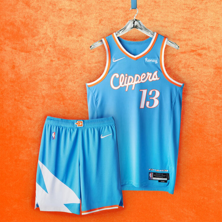
Los Angeles Clippers – The Clippers use its Pacific Blue colorway from its past in Buffalo and San Diego for its City Edition jerseys and the trim, accenting, and numbers are from the Clippers’ first season in LA in 1984. The Buffalo logo is seen on the belt and a series of maritime signal flags that spell out “Clipper Nation” is seen above the jock tag as a thank you to Clipper fans through thick and thin.
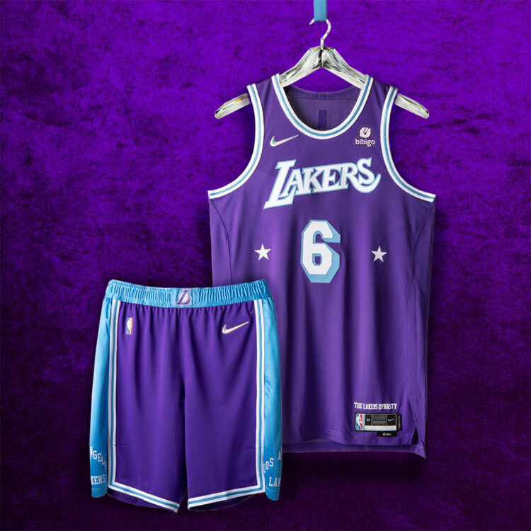
Los Angeles Lakers – The Lakers blend its baby blue Minneapolis beginnings as accenting with its 1960s LA Lakers purple on their City Edition jerseys. The belt uses the L logo from the Lakers 3-peat in the 2000s and “The Lakers Dynasty” is printed above the jock tag.
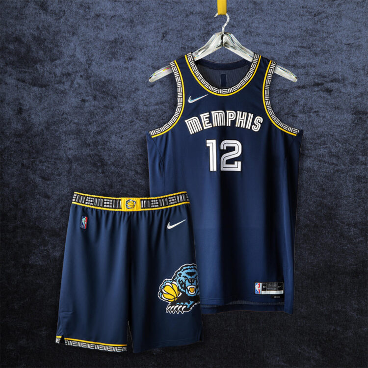
Memphis Grizzlies – The Grizzlies got their start in Vancouver which can be seen on the trim of the jersey and shorts with the 2002 Grizzlies logo in the current Memphis colorway on the shorts. The Grit and Grind era Grizzlies are represented with the colorway of the jersey and the Bear Claw logo is seen on the belt.
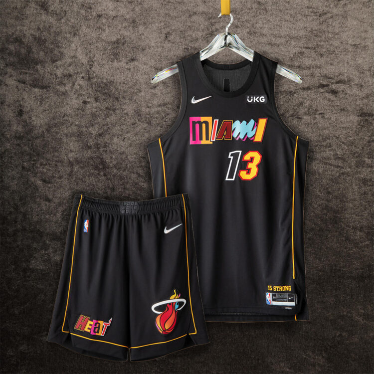
Miami Heat – The Heat use a scrapbook collage approach to their City Edition jerseys with each letter taking from a different era of Miami Heat basketball. The Heat logo on the shorts uses different colors from each era as well with the gold piping representing the infamous yellow ropes brought out seconds before “The Shot” during the 2013 Finals.
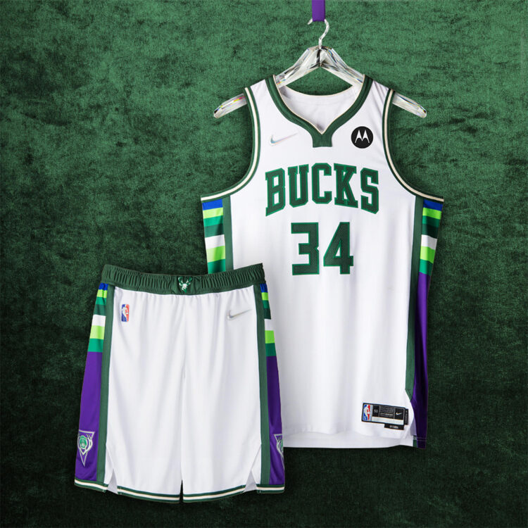
Milwaukee Bucks – The Bucks go back to the ’70s and ’80s with the paneling of the jersey and shorts and the purple paneling is from the Ray Allen and Glenn Robinson-era of the Bucks of the 2000s.
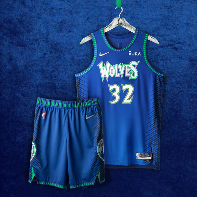
Minnesota Timberwolves – The colorway goes back to 1989 from the Timberwolves’ inaugural season with the Wolves font and number inspired by the Kevin Garnett era with more 2000s detailing is seen with the pine trees on the trim. The shorts feature the old and new logo respectively on each side as well.
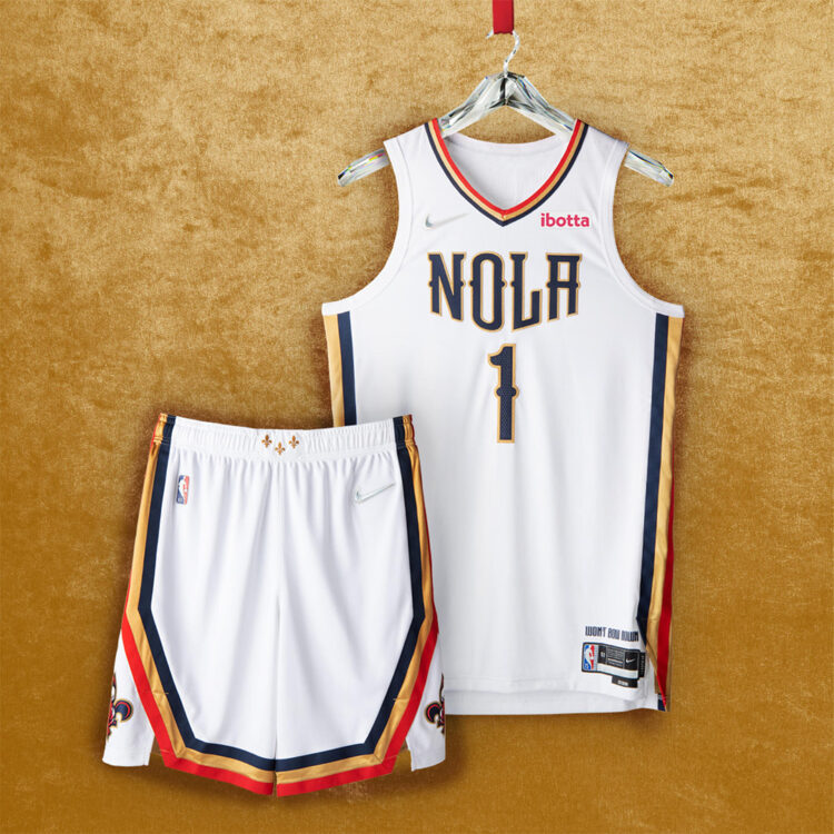
New Orleans Pelicans – The Pelicans use an iron wrought-inspired font on the chest made in a formation similar to Pelicans flying with the belt using iconic fleurs-de-lis in Mardi Gras gold.
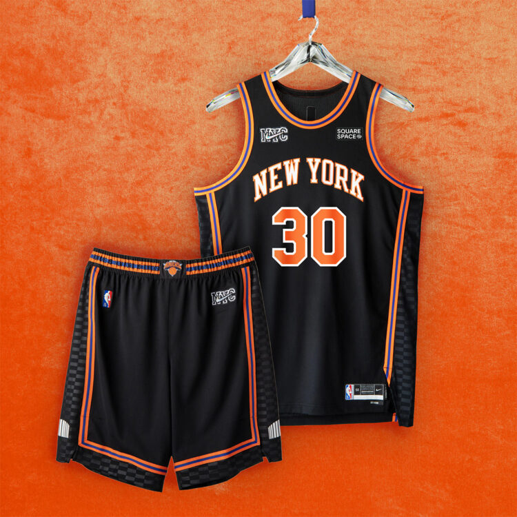
New York Knicks – The Knicks use a black base for the City That Never Sleeps with the Madison Square Garden appearing on the shorts on each side. Orange and Blue accent the jerseys with Nike using their Nike NYC logo instead of the traditional Swoosh.
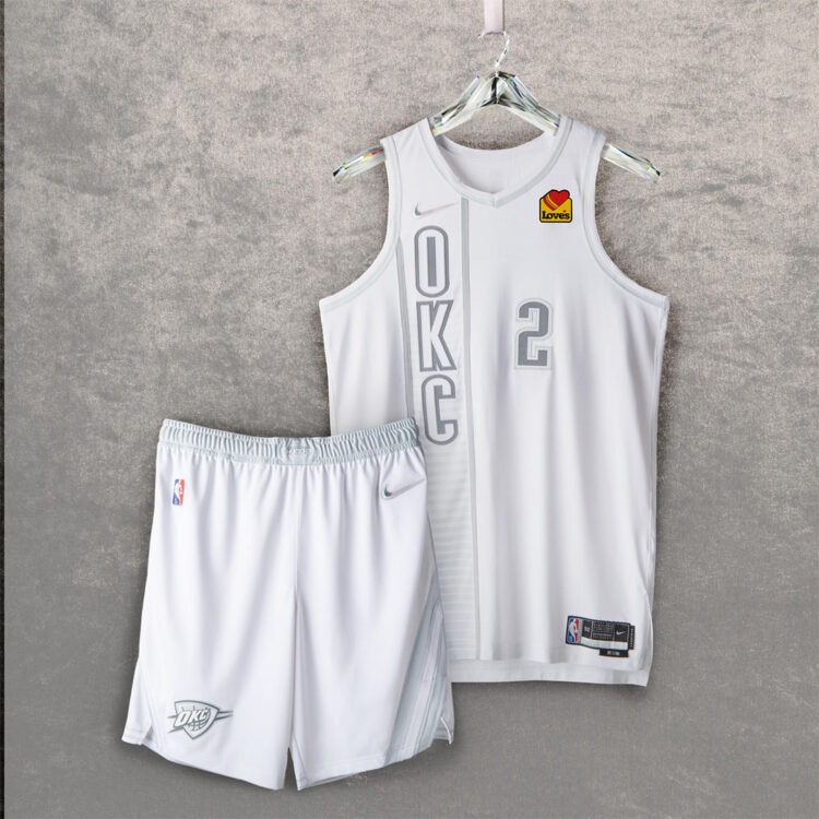
Oklahoma City Thunder – The Thunder use a white and grey take on their navy alternate jerseys from 2012-2016 in which Kevin Durant won MVP. The sash on the shorts honors Oklahoma’s indigenous culture with the belt using OKC’s logo from its inaugural 2008 Summer League season.
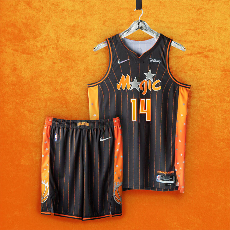
Orlando Magic – The Magic ditch the Atlantic Blue for orange to symbolize the orange groves that helped build Orlando’s economy with the OG Magic logo appearing on the chest with the pinstripes reading out “WHY NOT US? WHY NOT NOW?”.
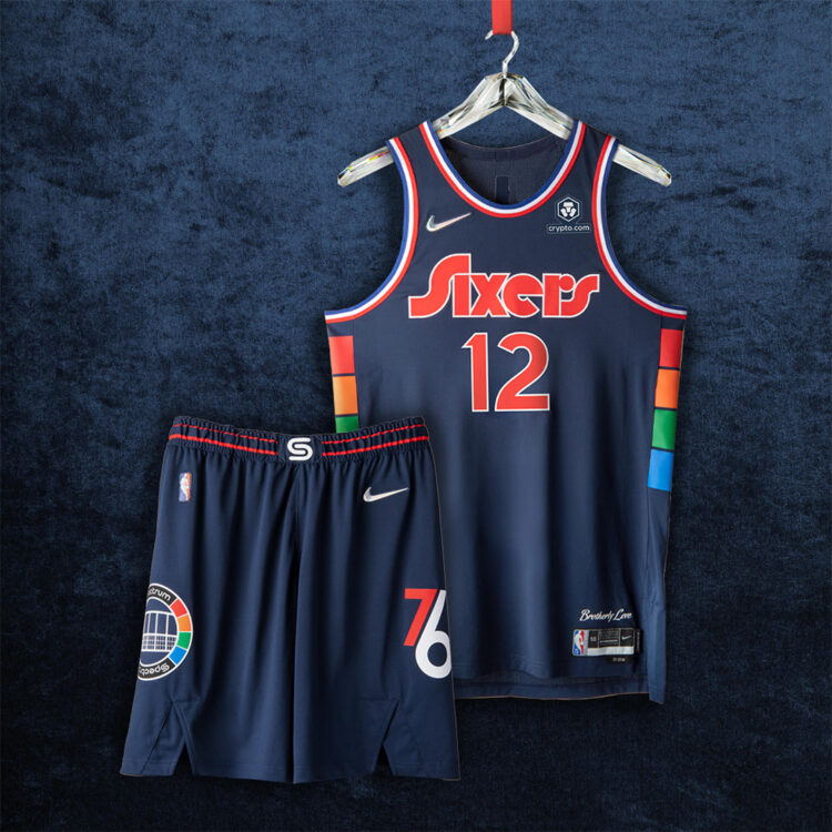
Philadelphia 76ers – The Sixers pay tribute to the Philadelphia Spectrum Arena with their City Edition jerseys with the Spectrum Arena logo appearing on the shorts and the arena’s multicolor pattern on the sides of the jersey.
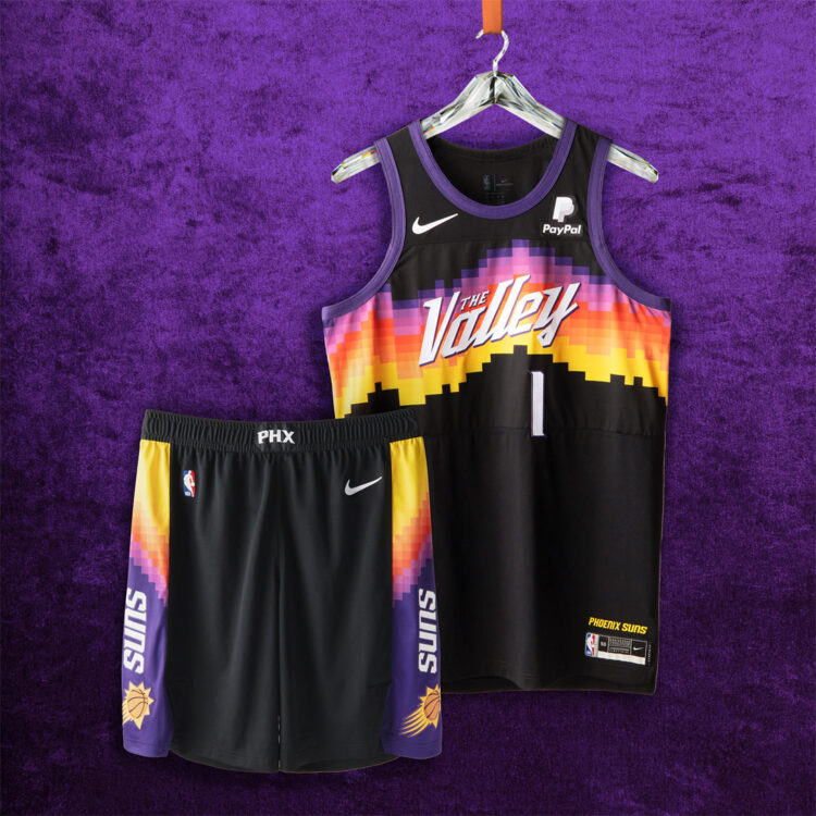
Phoenix Suns – The Suns run it back with their City Edition jerseys with the pixelated landscape of the Phoenix’s sunrise and sunset while sitting on a black jersey.
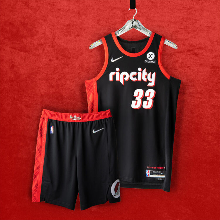
Portland Trail Blazers – The Blazers take it back to 1977 which features the font of 1977 on the back with the side paneling using a plaid print inspired by Dr. Jack Ramsey’s suit on the sidelines. The front features “ripcity” in the ’90s era font and “City of Roses” is printed above the jock tag.
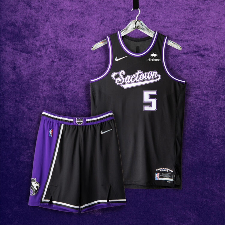
Sacramento Kings – The Kings take it back to their Kansas City roots with “Sactown” written across the chest in a script font and the asymmetrical shorts are a tribute to the 2000s Kings team that featured Chris Webber and Jason Williams.
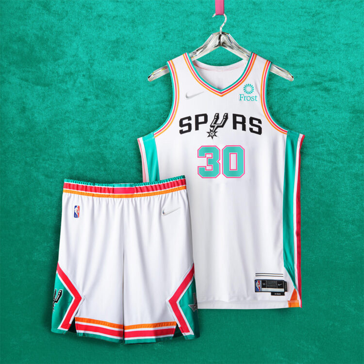
San Antonio Spurs – The Spurs use their Fiesta striping as accenting which was first seen on their warm-ups in the ’90s and the shorts feature the current Spurs logo on one side with its ABA origin roadrunner logo of the Dallas Chaparrals on the other side.
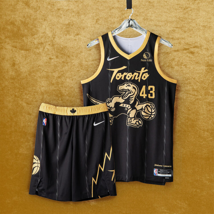
Toronto Raptors – The Dino makes a return while using the black and gold colorway made famous when Drake’s OVO colorway made its way onto the Raptors jersey a few years ago. The jagged pinstripes from the Vince Carter era are subdued in black and the Maple Leaf is seen on the belt.
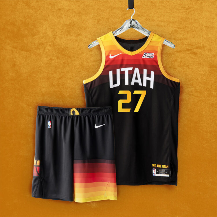
Utah Jazz – The Jazz run their City Edition jerseys back from last year with the gradient red-rock-inspired detailing that makes its way from the top of the jersey down to the bottom of the shorts.
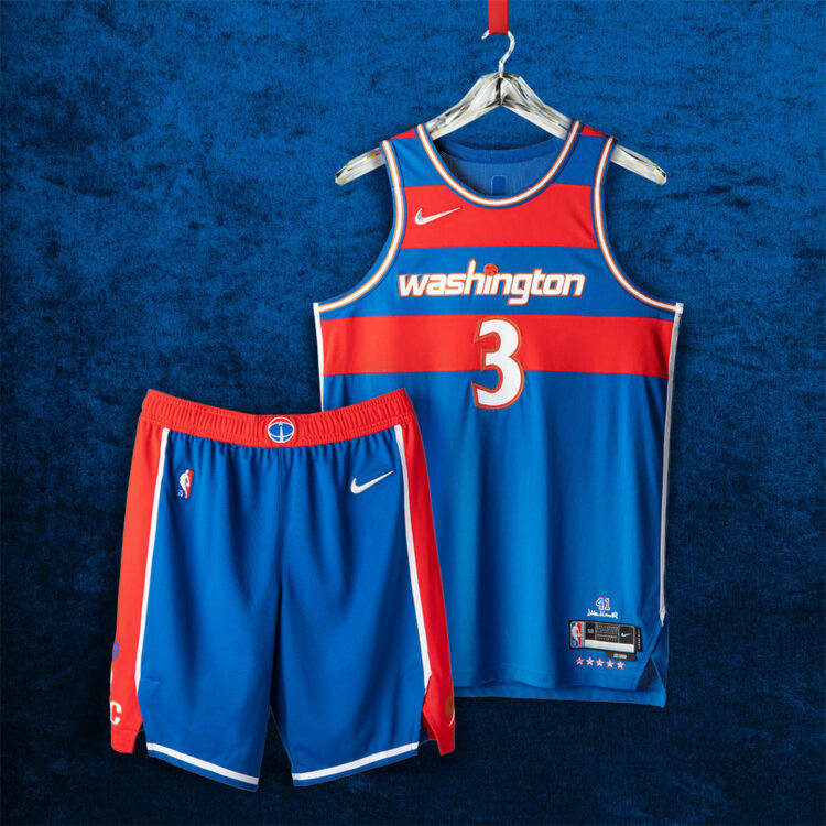
Washington Wizards – The Wizards take it back to the ’70s where Wes Unseld won Rookie of the Year and MVP in the same year wearing a similar blue and red striped jersey. The Gilbert Arenas-era numbering is featuring alongside the ’90s era logo on the shorts and Wes Unseld’s signature and number are seen above the jock tag, a nice touch as his son Wes Unseld Jr. is coaching the Wizards today.