This post may contain affiliate links. Please read our disclosure policy.
In 2018, designer streetwear serves as the dominant force in fashion with the likes of Virgil Abloh, Jerry Lorenzo and Ronnie Fieg ranking as household names amongst sneakerheads.
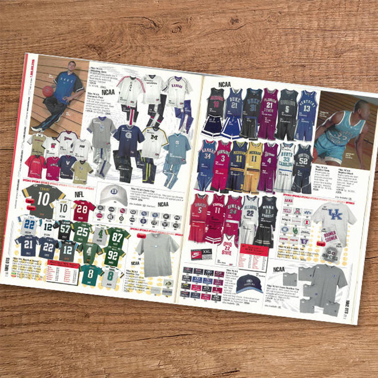
20 years ago, however, sportswear was it. From jerseys to jackets, fan gear was the freshest category in clothing and nobody knew that better than Nike. Taking over college sports, the brand was able to redefine and tier performance product with a keen eye for material, font and logos.
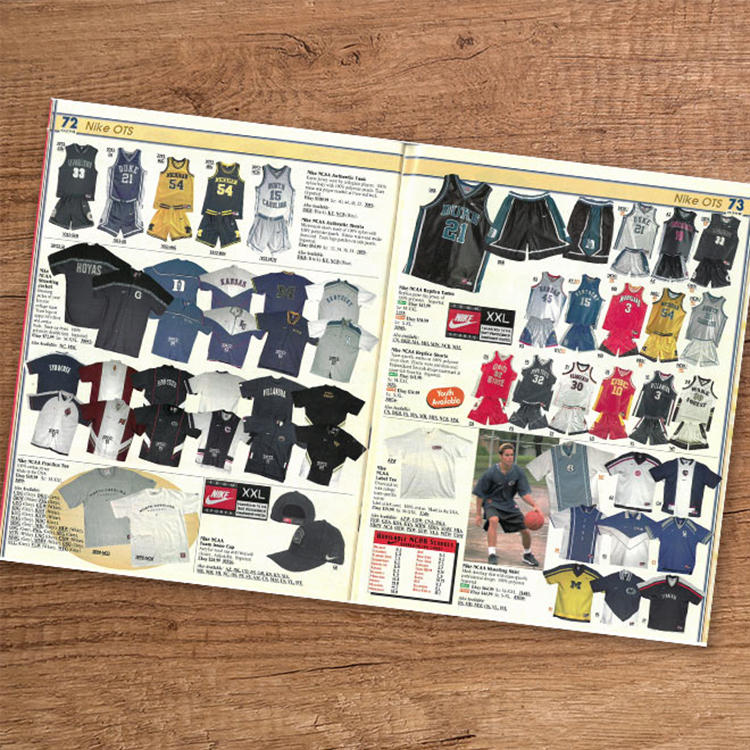
So, how did it all go down and who was actually doing it? Drew Hammell of Eastbay Blog sat down with Ken Black, a former Nike graphic designer who played a major part in everything from the Iverson-era Georgetown gear to the still swaggy Syracuse logo.
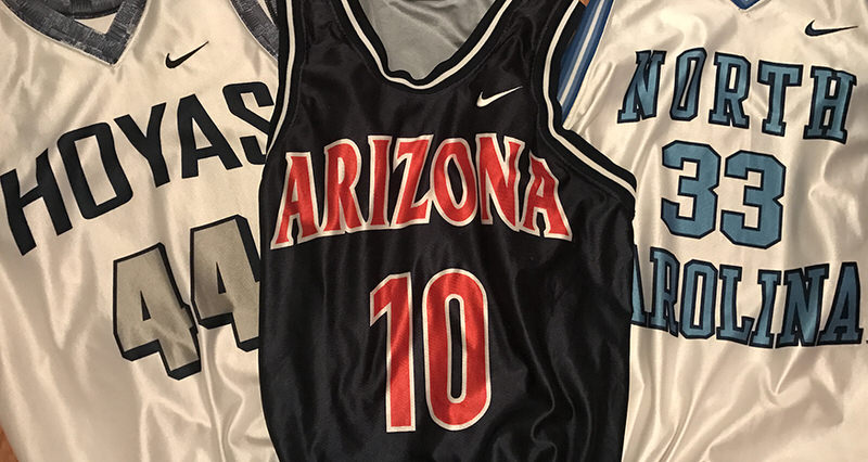
On the Georgetown Uniforms
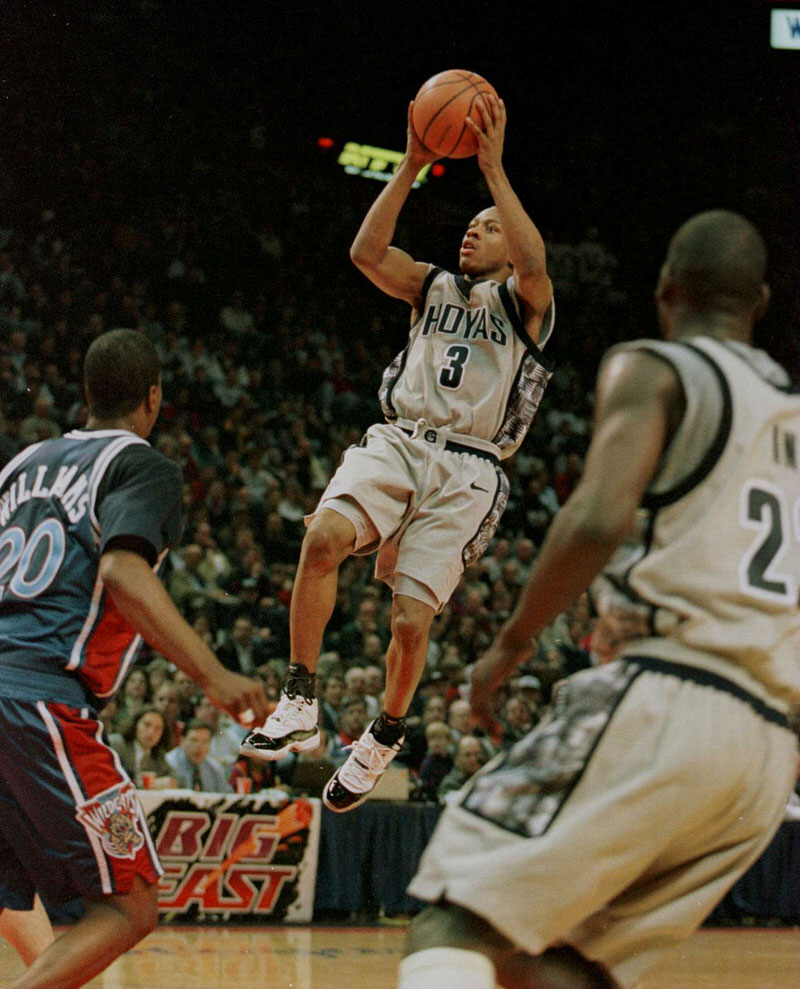
Ken Black: Working with Georgetown, (we wanted) to give them a classic “G” for their identity program. (The original design had a basketball in the middle.)
I would probably have to say Georgetown (was my favorite) – so much packed into that uniform. We wanted to give them something classic with real gravitas, so we pushed it to the navy and grey – with Hoyas on the grey and Georgetown on the navy. Coach Thompson wanted a strong cultural connection, too. I can’t remember which season we added the Kente print, but wow, it felt so important. (And even better when Iverson wore it with Jordan XI’s, which I had also worked on with Tinker.)
On the Duke Uniforms
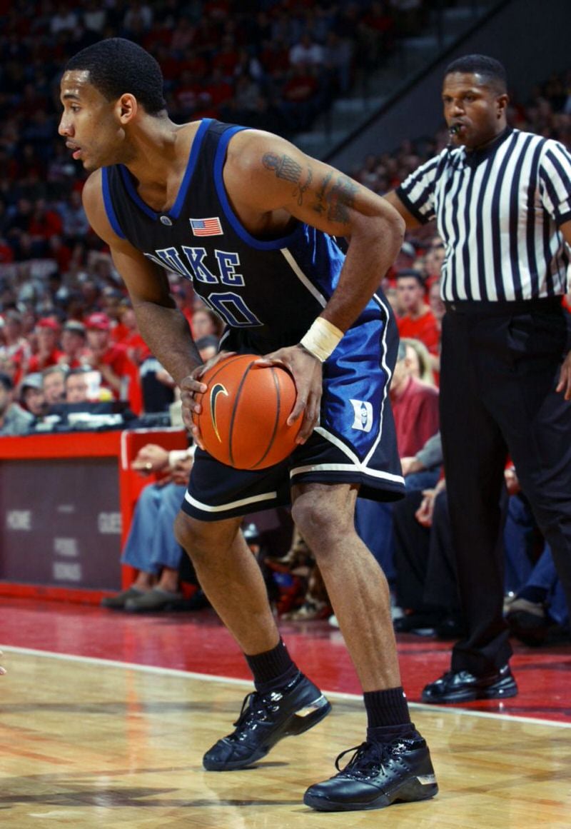
Ken Black: The Duke black jersey was another big one, and it was fun to make subtle tweaks to it over the years.
We recognized immediately that the shorts Duke wore were ones that dozens of others teams copied, so we immediately changed the bottom of the shorts to match the shape on the inside of the Iron D logo. We framed that logo perfectly and immediately made it signature to Duke and identifiable to anyone if it was copied by another team.
On the Arizona Uniforms
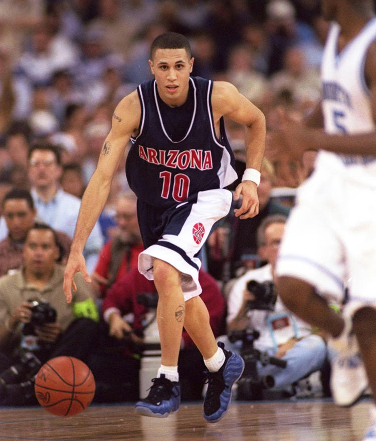
Ken Black: (On) the second version of the shorts, the navy colorway with the fat stripe down the side, wide white double band at bottom. The circle “A” logo on one leg and vertical CATS on the other – I freaking loved these shorts. The mini-mesh gave it an athletic feel with an incredibly slinky and smooth finish and drape. It looked great and felt even better to wear.
On the Syracuse Uniforms
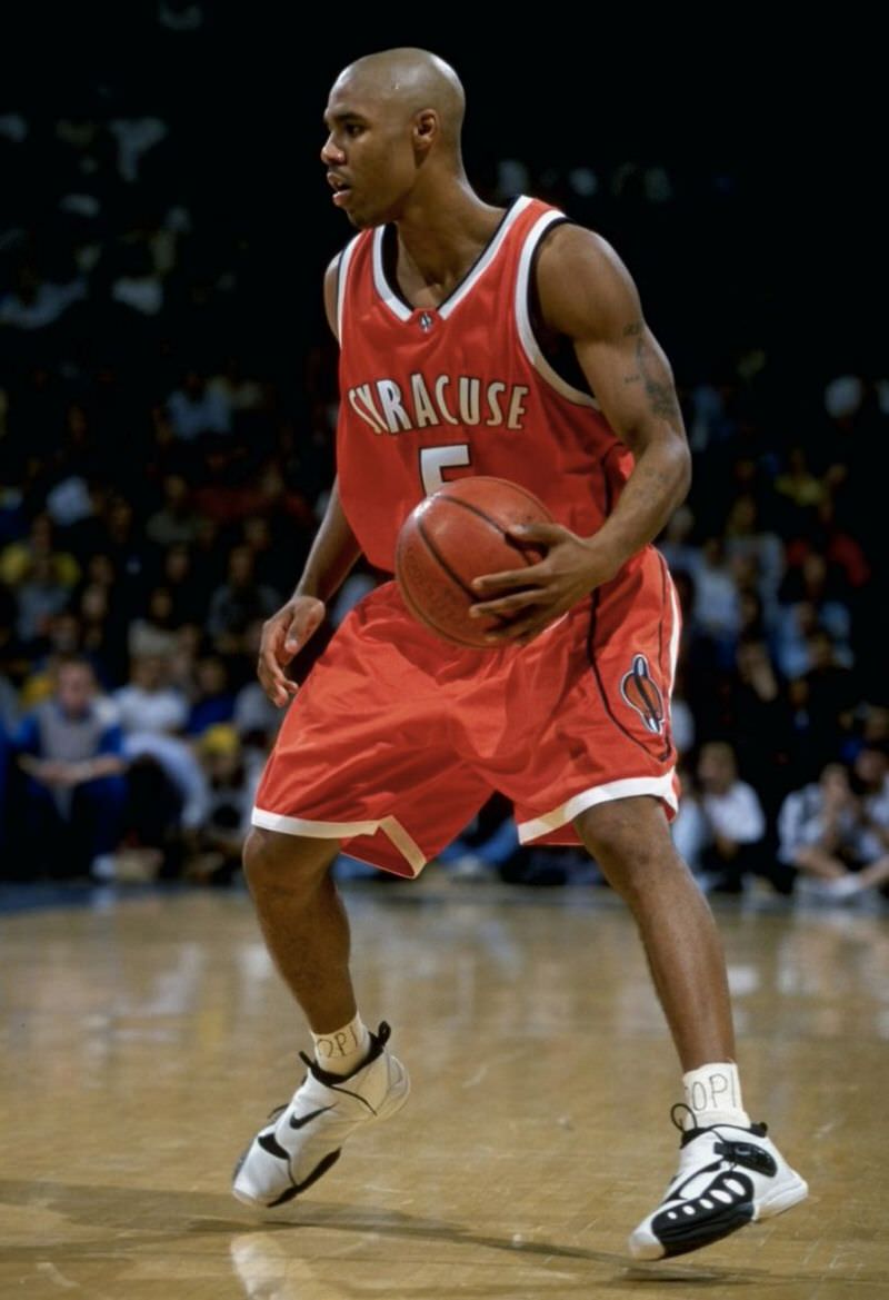
Syracuse was fun too – those came later and I think they were one of our first real uses of sublimation on jerseys and shorts. We still tried to keep it classic and refined, but the sublimation allowed us to lighten the heavy trims and begin to explore more performance properties. Sublimation also allowed us to create that curved side panel to perfectly frame the Syracuse basketball logo we’d created for them. We still used twill numbers and twill-and-embroidered logos where we could, because it gave a nice weight that made the players feel it was made for gameday.
*****
Check out the entire conversation here.